IEEE Trans. Visualization & Comp. Graphics (Proc. InfoVis),
2009
Protovis: A Graphical Toolkit for Visualization

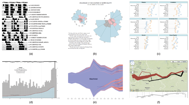
Example protovis applications. (a) Jacques Bertin’s analysis of hotel patterns. (b) Florence Nightingale’s chart of deaths in the Crimean War. (c) A trellis display of barley yields. (d) William Playfair’s chart comparing the price of wheat and wages. (e) The Job Voyager. (f) Charles Minard’s flow map of Napoleon’s march to Moscow, as a Google Maps “mash-up”.
abstract
Despite myriad tools for visualizing data, there remains a gap between the notational efficiency of high-level visualization systems and the expressiveness and accessibility of low-level graphical systems. Powerful visualization systems may be inflexible or impose abstractions foreign to visual thinking, while graphical systems such as rendering APIs and vector-based drawing programs are tedious for complex work. We argue that an easy-to-use graphical system tailored for visualization is needed. In response, we contribute Protovis, an extensible toolkit for constructing visualizations by composing simple graphical primitives. In Protovis, designers specify visualizations as a hierarchy of marks with visual properties defined as functions of data. This representation achieves a level of expressiveness comparable to low-level graphics systems, while improving efficiency--the effort required to specify a visualization--and accessibility--the effort required to learn and modify the representation. We substantiate this claim through a diverse collection of examples and comparative analysis with popular visualization tools.
