Sizing the Horizon: The Effects of Chart Size and Layering on the Graphical Perception of Time Series Visualizations
abstract
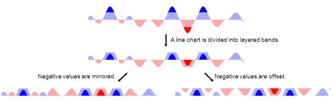
We investigate techniques for visualizing time series data and evaluate their effect in value comparison tasks. We compare line charts with horizon graphs--a space-efficient time series visualization technique--across a range of chart sizes, measuring the speed and accuracy of subjects’ estimates of value differences between charts. We identify transition points at which reducing the chart height results in significantly differing drops in estimation accuracy across the compared chart types, and we find optimal positions in the speed-accuracy tradeoff curve at which viewers performed quickly without attendant drops in accuracy. Based on these results, we propose approaches for increasing data density that optimize graphical perception.
materials and links
citation
ACM Human Factors in Computing Systems (CHI),
2009