
The Design of Sense.us
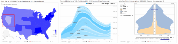
Visualizations from sense.us. (a) Interactive state map. The image shows the male/female ratio of the
states in 2005. (b) Stacked time-series of immigration data, showing the birthplace of U.S. residents over the last 150 years. The image shows the number of U.S. residents born in European countries. (c) Population pyramid, showing population variation across gender and age groups. Additional variables are encoded using stacked, colored bands. The image visualizes school attendance in 2000; an annotation highlights the prevalence of adult education.
materials and links
citation